Expedition 33

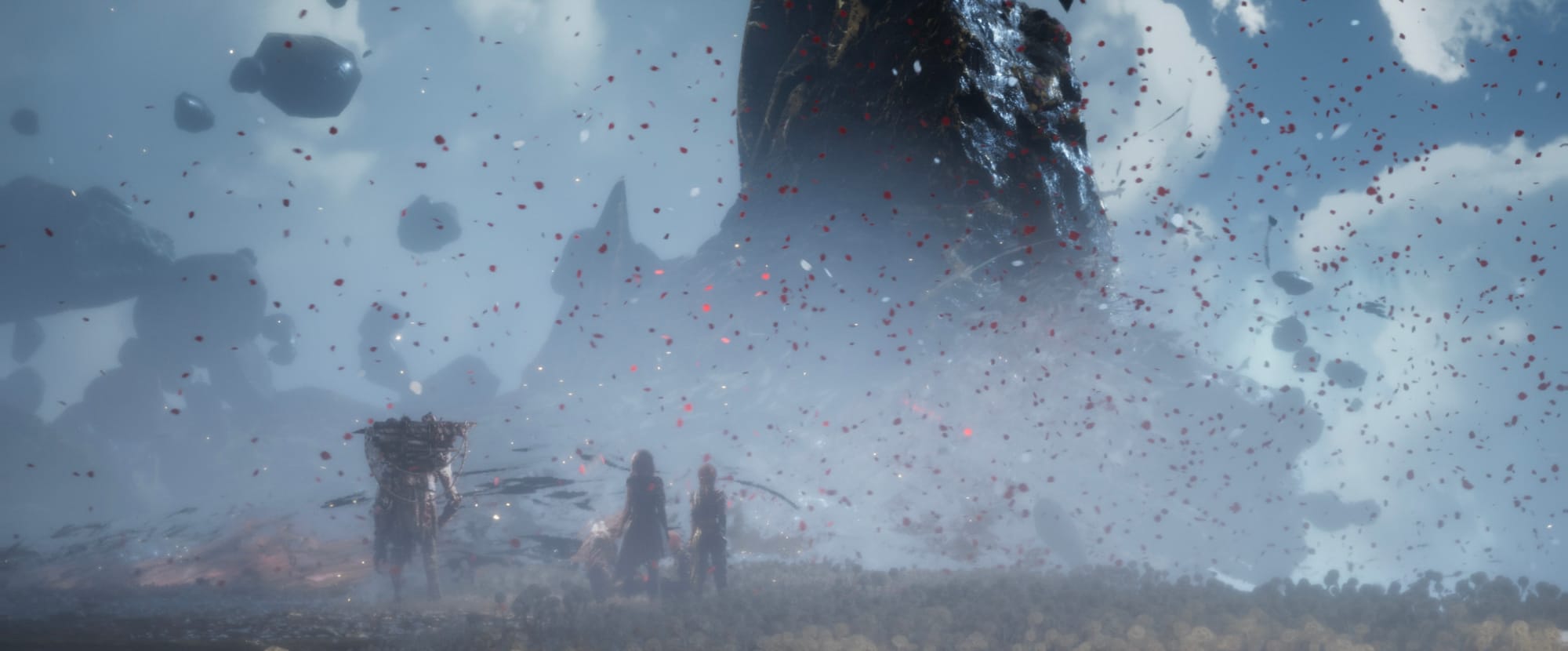
Inga spoilers här, lovar. Jag har haft (och har fortfarande) väldigt roligt med Expedition 33, ett spel som verkligen sticker ut.

Det ska enligt utsagor vara en modern twist på klassisk JRPG. Vad det betyder vet jag inte riktigt, eftersom jag varken har erfarenhet av JRPG eller turbaserade spel över huvud taget. Men det här är utan tvekan ett av de mest minnesvärda spelen jag spelat på länge.

Jag har behövt ta hjälp av Google och guider några gånger för att ta mig över vissa trösklar som kommer med att inte vara bekant med genren, men det har varit värt det. Varje gång jag lyckats räta ut ett spelmekaniskt frågetecken har spelet blivit ännu bättre. Samtidigt är det inte mekaniken som gör helheten. Det är storyn.

Det som verkligen fastnar är känslan, både i världen och i berättandet. Det är snyggt så det förtar, ljudet och bilden är ren konst, och berättelsen hänger kvar även efter att man stängt av. På det sättet påminner det faktiskt lite om Outer Wilds, även om de två spelen i övrigt inte har mycket gemensamt.

Det här är ingen AAA-titel, men den slår definitivt över sin viktklass. Ambitionen är hög, och genomförandet imponerar, särskilt med tanke på att det är en liten fransk indiestudio som ligger bakom.

Expedition 33 får därför min varmaste rekommendation.

Goodbye Wordpress, hello Ghost (and ActivityPub)

I’ve been meaning to leave WordPress for years. It's such a capable platform, but also ridiculously overkill for my simple blog needs. I've been meaning to replace it with... something, for a long time. Something lighter, smaller, faster and preferably that ties well into federated social media. I’ve explored both WriteFreely and Micro.blog, but nothing stuck. But with Ghost 6, things changed.

I was actually a backer to the initial Ghost Kickstarter. It promised a writer-focused publishing toolm and they delivered on that promise, but I never switched. At the time, I was deep into podcasting, and the need for a blog just wasn’t there. But my podcasting days are (for now) over, and the thing I miss the most beyond hanging out with my old podcasting friends, is having a channel for thinking out loud. And with the demise of Twitter as we knew it, there wasn't much social media for me to hang around on, and I feel like I missed the boat to Mastodon and the other platforms.

But then Ghost version 6 launched, with ActivityPub support, which seemed like the thing I was waiting for. Something leaner than Wordpress, with federated social media features built in.

The official Ghost hosting seems great, but I quickly realized that it’s also quite expensive, especially if you want to dabble with customizing themes. Their lowest tier that allows theme customization beyond the default theme starts at $29/month. That's for sure more than I'm willing to pay. I asked Ghost about tiers for us individual small time bloggers, and they refer to others offering Ghost hosting. So I started looking around.

The closest affordable alternative I found was PikaPods, which hosts a bunch of open-source apps in containers, including Ghost. But at the time of exploration, they didn’t support Ghost 6, and offered no information on when or if that would be available. And I'm quite impatient, so I rolled up my sleeves and went the self-hosting route.

I spun up a small virtual server on Linode, using their $ 5/month Nanode plan. It’s the smallest VM they offer, but still meets the requirements for running Ghost 6.

II went with Docker Compose for simplicity and reproducibility. The stack includes:

I’d love to say I figured all of this out on my own, but no, ChatGPT held my hand through all this. I'm no developer, I know nothing about servers. I fed it all the documentation for ghost 6 self hosting and their community forum and took it from there. We did it two times. First using the Ghost CLI, which we got up and running fine quite quickly, only to learn the ActivityPub features of Ghost 6 only works when doing it with Docker Compose. So VM was scrubbed and we started over. Some small issues along the way to get ActivityPub to behave, but nothing a little prompting with some back and forth with terminal commands and logs to figure out the issues. All in all, the setup took about an hour.

And this is it. This is Ghost 6 running on a Nanode server. A clean, fast blog. no bloat, no plugins, no blocks, no Gutenberg editor. Feels refreshingly clean and nimble. Now I'll do my best to focus on content more than theming.
Pointless Document Format

The internet loves PDFs and I don't understand why. They serve one reasonable purpose, making sure that whatever you send to a printing service comes out looking the way it's supposed to look. For just about any other use case, the web is a better solution.

Ways in which PDFs are inferior to using the web:

  • Not responsive. PDFs don’t adapt to screen size, forcing you to zoom and pan on small screen devices (which account for two thirds of all web traffic).
  • No live updates. Once downloaded a PDF is frozen in time, updates require sending or finding a new file. Which leads me to:
  • Version confusion. Multiple outdated versions often circulate, leading to misinformation and inconsistencies.
  • Hard to navigate. The web has a whole lot of tricks for navigating content. The PDF offers... I don't know, anchor links?
  • Isolated from context. A PDF offers no context. No related content. And no clear way to verify source or sender.
  • Limited multimedia. Embedding videos, animations or charts or pretty much any type of interactivity is awkward, difficult or impossible.
  • Extra work. You create the content, export it as a PDF, then figure out how to send it, usually as an attachment, and someone needs to download it, and hopefully be able to open it. On the web, you just publish and share a link. Done. All messaging services supports links, all devices today have a browser.
  • Easily manipulated. PDFs look official and final, but unless digitally signed (most aren't) they can be altered without leaving clear evidence, making it risky to assume their contents are true or legally binding.
  • Security risks. PDFs can carry malicious scripts, making them a risky file to open. The web is not risk free of course, but at least offers some options to verify legitimacy.

While writing this, I’ve identified two other possible advantages: offline availability and archiving. Offline? We’re rarely without an internet connection these days, and most of the content people put in PDFs doesn’t need offline access. Archiving? That’s more a question about where and how you store something, not what file format it’s in.

If your goal is to share information, use the web. It's pretty great [1].


  1. It's been better. But that's another post for another day. ↩︎


You get a bonus, and you get a bonus, and you get a bonus

https://www.theverge.com/command-line-newsletter/756561/openai-employees-bonus-sam-altman-ai-talent-wars

The bonus amount for each qualifying employee will vary based on role and seniority, according to my sources. The highest payouts will be in the mid, single-digit millions for OpenAI’s most coveted researchers, all of whom already make millions per year. Engineers, meanwhile, are expected to receive bonuses worth hundreds of thousands of dollars on average. The bonuses will be paid out every quarter over the next two years, with the option to receive the money in OpenAI stock, cash, or a mix of both. Roughly 1,000 employees, or about one-third of OpenAI’s full-time workforce, qualify.

That's crazy. The AI hype train is one hell of a train. Should've been an engineer.

Consistency

Right around the time when the multitouch trackpad was announced, Apple introduced natural scroll. Natural scroll reversed scroll behaviour (move content instead of viewport) and set it to default while offered a setting so you can change it back if you want. Importantly, that setting affects all scroll behavior in macOS, which of course it should.

Enter iOS 26 beta 1 and its new UI, including its new camera app design. Instead of picking camera mode by sliding it into the middle like before, you move along a sliding tab bar with a highlighting piece of glass UI. It reversed the behaviour from before and took some getting used to. But with beta 2, they reversed course. Now you manipulate the tab bar behind the glass piece. While it mimics the original camera app more closely, it creates an issue because the glass highlighter isn't abstract, it's very much something on top of the different modes. So now you're moving something that is positioned below something while interacting above it, on a UI element that is not interactive, which is definitely not intuitive. And it get's worse by the fact that if you look at the tab bar in Safari, or any app with the new glass tab bar, it does the opposite. So you have two tab bars with glass highlighting your selection that operates in two different ways. That's a mess.

For camera modes, drag tab bar to change.
For Safari tabs, drag the glass selector to change.

With a recent beta, they also included an option to toggle how you want the behaviour in the camera app, but unfortunately it defaults to the non-consistent one. And adding settings for such obscure things? That is distinctively non-Apple. Decide what's best and stick to it. I hope this part sees some improvement in the coming betas or later.

This is just one small thing in a new design language that is objectively problematic in so many ways. Subjectively, I just think it looks really bad.