Exit interview: Tesla Model 3

We're on the last stretch with our 2021 Tesla Model 3 Dual Motor which is being replaced with a Kia EV9 next week (I'll write about that car too, don't worry).  I've held a lot of opinions about this car for the last three years and I thought it would be a good idea to close the chapter on this journey. For myself in the future should I consider Tesla again, and for others who might have a TM3 in the past or future.

First of all, this car is fun. Quick as hell and glued to the road. It's fairly comfortable and it has excellent range all year around. For the 60 000 km we've traveled, we've averaged 167 Wh/km which is not bad in real world conditions in mostly cold Sweden. The sound system is quite good, the infotainment system has most stuff you need (I've never actually missed CarPlay), the app works well enough, the car always starts, and the Tesla Supercharger network is excellent.

In fact, the charging network and how fun this car is to drive would be my main pros with this car.

The list of annoyances is quite a bit longer. Nothing's to say the new car will be any better, you don't know until you live with a car. It reviews well, but you never know. Anyway, this would give me a chance to post again when I apologise for the bad rap I will now give Tesla when I realise the competition still hasn't caught up and things are somehow worse than they are now. Time will tell.

First off, the wind shield wipers which are camera based in Auto are just terrible. Most of the time it misses the mark. Either it's in deep slumber when it's pouring down or it's whacking away its dry rubber on a dry windscreen on a sunny day making not so lovely sounds. I hope they tested the manual wipe button on the left stalk for longevity, because even though this car has very few buttons, that is one of them, and I push it ALL. THE. TIME. On the Swedish west coast, rain is default, and summer is not a season, it's a day. If you're lucky. We need those wipers to work.

Speaking of wipers, the wiper fluid is dispensed from the wipers, not shot up on the wind shield. This makes them not spread as well so you need to use more, which is sad because the fluid container is quite small. This design also makes them more susceptible to freezing. And once they're frozen during freezing temperatures, there's nothing you can do except wait for weather to be warmer before you can use them again.

No lip on the trunk so if you have snow on your car and open the trunk, you'll have a trunk full of snow. Not great. But you'll be occupied with booking service for the too weak electric trunk motor that probably broke when you tried to open your trunk with some ice around it, so perhaps you forget about it. While waiting for service, if you get thirsty, you can always open the frunk and have a sip of meltwater that consistently makes its way in there somehow. Tesla has tried to fix this twice. It's better, but it still get's wet. Keep little there.

Autopilot is a twitchy friend. When it works, it's great. And I don't mean the "spend-the-equivalent-of-a-small-extra-car"-expensive full self driving package, I mean the regular cruise control with lane assist type of feature. Dry and not too rainy or too sunny days it will mostly do a good job. But it has a lot of nervous breaking going on. Sometimes the car thinks that a highway is no longer a highway and will start aggressively breaking which is really disturbing and potentially dangerous for people behind. No one expects a car on the highway to behave like that if there's no jam or anything up ahead.

The car makes a whole lot of sounds. There's the silly Joe mode that lowers the sounds but not nearly enough. And most of the alerts are incorrect. It's blaring it's alarm once in a while for crossing legal lines even though I use the turn signal.

The fit and finish of the car is not great. Panels are not aligned, a lot of gaps, flimsy attachments and the the material quality for most things are within below average and average, at best.

And then there's the door handles. I've not yet been in a situation where I don't have to explain to someone not familiar with Teslas how to get into the car. Or out. Tesla is really pushing the envelope of complicated unnecessary door opening solutions. You should not have to give people a tutorial on how to get in or out of a car. That's objectively poor design.

There's more, like the weird steering wheel with the controls that doesn't seem to be designed to go sideways yet a lot of features rely on this. Thin paint job, the car had fart and rainbow cowbell features before the ability to add a stop along the route of your navigation. That shows some serious priority issues.

...that said. I'm going to miss it. It had a lot of character. It's whimsy, perhaps to a fault, but it was never boring. It has always done the job and we've had fun along the way and all things considered, all my annoyances are fairly minor ones, and Teslas will continue to improve as they mature. I might consider a Tesla again in the future, if I can overcome the fact that it's made by a company owned by Elon Musk.
Song of the day: GERD – Happier Than Me

https://open.spotify.com/track/14c0lplAxwyh520z3sH5w3?si=_Ki0xJ7-SM2yVYc4uPohwA

Late 2023 I discovered Swedish artist GERD via Spotifys Discover Weekly. It's one of those rare moments when Spotifys AI truly delivers value to me as a user. GERD is so right up my alley you wouldn't believe it. That also makes her the perfect starting point for a perpetual series of "song of the day" posts.

My first reaction to GERD was that she sounds like the closest thing Sweden has to a Hannah Reid in English act London Grammar (one of my all time favorite bands). GERD is a little more electro pop and retains the same type of vibe while adding a level of playfulness to her songs and vocal delivery. Oh how I would love to make a track with GERD singing.

Her catalogue is only a handful of releases so far, but big enough to spot the trend of being brim full of creativity and lacking conformity to regular structure. The songs seem written and produced the way they want them to, following their own whims, without any particular care for how it should fit any type of formula. It's by no means avant garde experimental music, but it's also not your good old standard format radio pop song. And it is EXCELLENT!

I could've made it easy for myself by just picking Let Me In as the song of the day, since it's my favorite GERD song. But her recently released Happier Than Me has that rare quality of being a song that get's better the more I listen to it. And songs that have that quality truly fascinates me since it's so very uncommon.

Enjoy!

Output, outcome and impact

A great ten minute video by Jeff Patton on how to approach product development by focusing on the behavioral changes you want in your users while addressing the uncomfortable truth that there are too many ideas, most of them suck and we can't tell which doesn't.

So much in product development are either broken or measured in a way that doesn't promote methods to actually succeed in providing the value that ensures a long term sustainable business.

I'll likely write at length about product development from my UX and PM perspective going forward and I will make no claims about knowing what I talk about all the time, it's a learning process for me too. Product development is complex and it's nowhere near "figured out".

What's up with Google Photos?

For "we're-printing-a-book-with-baby-photos" reasons I'm currently forced* to use Google Photos to organize the photos we want included. And I'm baffled. I just assumed that since Google Photos has been around for so long it would be at least a couple of steps ahead of iCloud Photos Library.

But oh no. This service is clearly not built by people that care about photos. Or people. Or use cases. Or volume. Or curation. Organise albums in folders? Nope. Batch delete? Nope? Different types of views? Faces identification? It's complicated for unknown reasons.

The only thing I've found that I was pleasantly surprised by was the ability to batch edit dates of a group of photos while keeping the time relative to each other. That's quite neat. But that's all.

It makes me truly appreciate iCloud Photo Library even more, how far it has come. I need to up my game to convert my Xbox loving, Windows hugging, Android swinging future wife to be to join me on this side.

*the only service we've found that supports the amount of pages we want is Optimalprint, which allows for Google Photos integration or direct file upload. However, if you want the book chronological, direct file upload doesn't work since they will come into the order they are uploaded which is not sequentially, so it turns into a mess. And there's no meta data, search or filtering, so you then have to re-arrange based purely on looking at them. That's a no go. That leaves Google Photos.

Caving to trends

Friskis & Svettis is an institution in Sweden. A non-profit movement started in the late seventies with the goal to get Swedes to become healthier by way of exercise. All Swedes are familiar with Friskis & Svettis, it’s a very strong brand, in fact one of the strongest in Sweden. And they have this beautiful timeless logotype that has been around since the very beginning, inspired by blood vessels and pumping blood. Designed by illustrator and typographer Lars Laurentii, and his personal favorite or all logotypes he designed. It’s a beautiful logotype with immediate and positive brand recognition nationally.

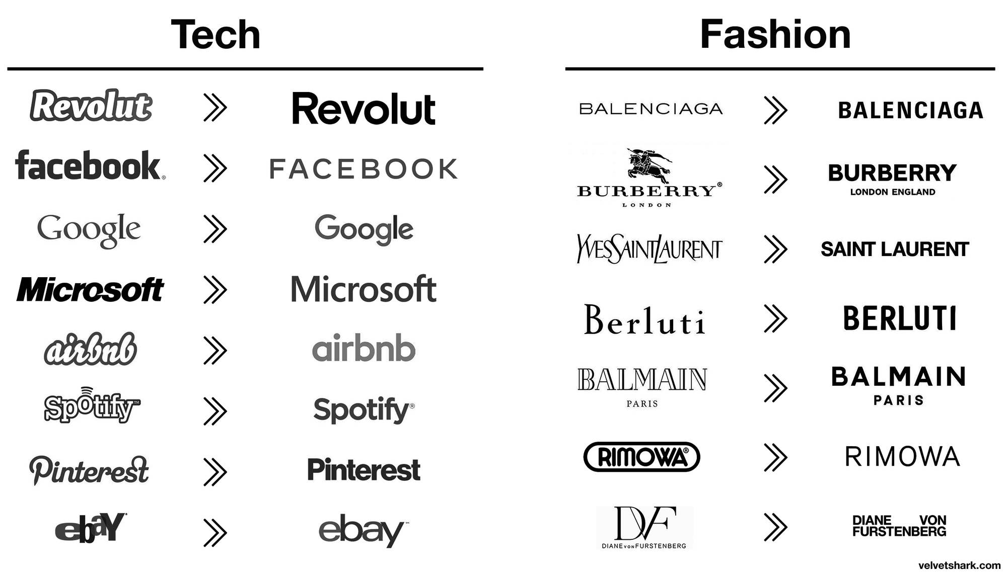
That’s why it pains me to see them make more and more use of a poorly spaced plain sans serif font like pictured above. I see it on busses, trams, billboards and online. It shows an organisation caving to recent design trends. Specifically the typographical logo trend to replace whatever you have with a minimalist sans serif font (the sans serif invasion) that says nothing about you as a company except that you’re now following instead of leading. The glimmer of hope here is that this generic font (Aperçu) didn't outright replace the old logo, for now only appending it or as a variant. The old logo is not out, but something is definitely in. And it has me worried and I hope they back away from this.

They already messed with the original logo once, making a less than stellar job updating it by making the lines thinner and adding rings. The changes disturb the harmony of the original, reducing the legibility and making it a little more sterile. And to no discernible benefit other than change for changes sake. Which is also a red flag of misguided attempts to address some type of challenge you as a company think you have.

The sans serif invasion is everywhere. Picture from Velvet Shark.

Not all companies have great logos. Most don’t. And for misguided design departments or desperate marketing teams, I see the allure to follow suit when big successful brands change their logos. But when you’re sitting on one of the highest regarded brands with a price winning logotype everyone recognizes in positive terms, brand affinity through the roof, you should probably think twice before touching it. If your business is in need of change related to trends or globalization or competitors or other business challenges, look elsewhere for change than your logo. Your logo is rarely the reason for your current challenges. And messing with a good one can cost your brand a lot, see also Tropicana.