Känner ni det? Känslan när gränssnittet väljer att hålla sig i bakgrunden så att ditt innehåll kan få skina?
Samtidigt: ”This creates a lively experience that makes using iPhone, iPad, Mac, Apple Watch, and Apple TV even more delightful”.
Delightful är inte ordet jag hade valt. Man slår knut på sig själv i att försöka rättfärdiga ett designspråk som inte borde fått lämna konceptstadiet. En himla massa fancy marketing speak för att rättfärdiga något man nog helt enkelt tyckte såg coolt och trots det höga priset av försämrad användbarhet, mot bättre vetande, ändå valde att gå vidare med.
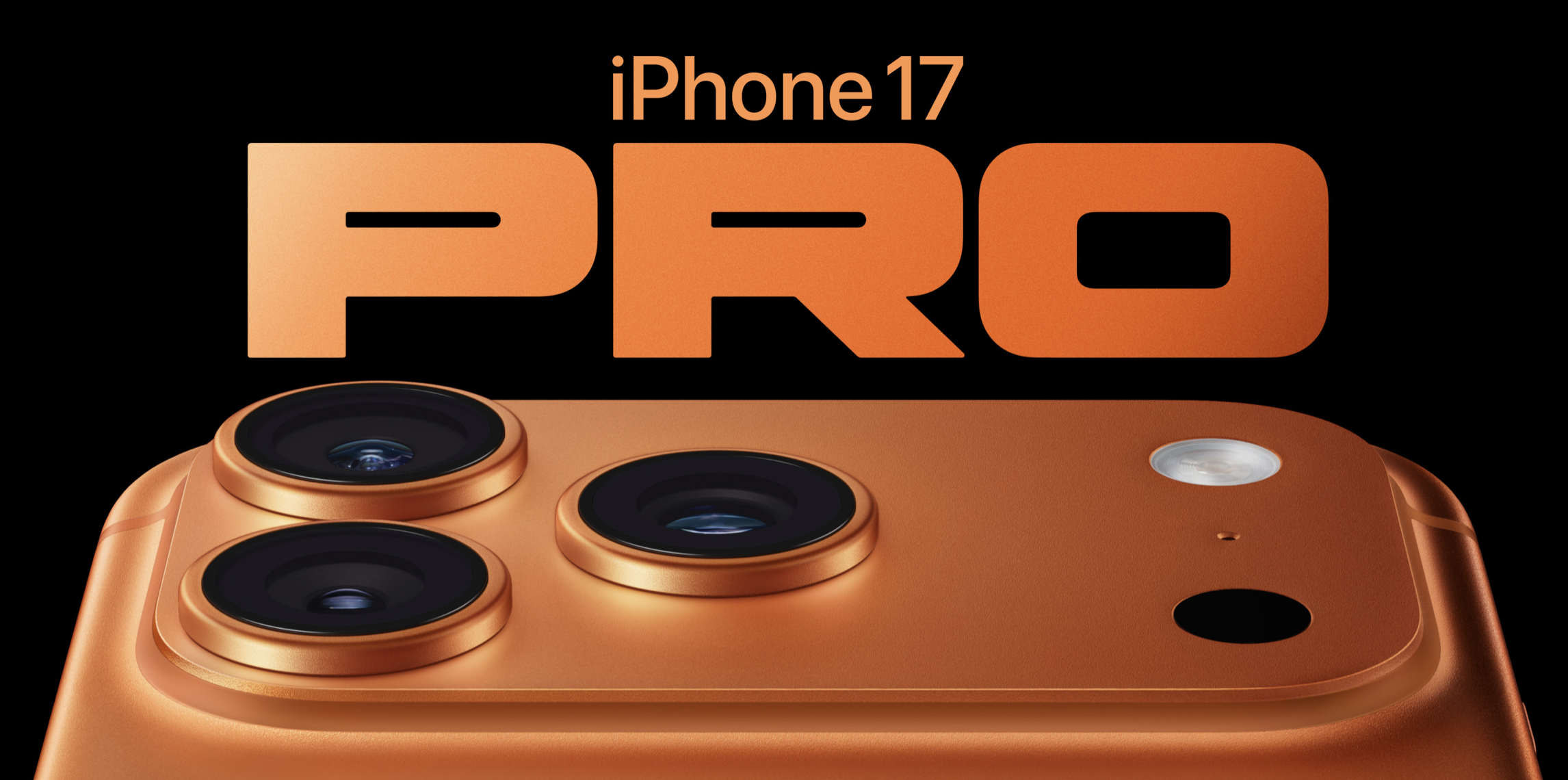
Inte en dag för sent att iPhone Pro-modellerna äntligen får någon roligare färg än bara mörkt, ljust och närmast homeopatiskt framavlade nyanser.
Orange råkar vara en favoritfärg, så visst kan jag vara partisk, men jag vågar ändå påstå att detta är den snyggaste iPhone Apple gjort. Den märkliga baksidan med den lilla keramiska rutan stör mig inte heller, snarare tvärtom. Den bidrar till en utility-känsla, vilket känns rätt för en produkt som ska heta “Pro”.
Egentligen hade jag tänkt hålla mig till att kommentera färgen på Pro, men eftersom iPhone Air faktiskt är en helt ny produkt i en helt ny kategori är det svårt att låta bli. Det är ett snyggt objekt med hög vill-ha-faktor, men ser samtidigt ganska svår ut att hålla i och skyltar tydligt med sina kompromisser. Framför allt på två områden som nästan alla skulle sätta på topp fem över viktigaste funktioner i en telefon: batteritid och kamera. Här har Apple (än en gång) på sin jakt efter tunnhet landat i en produkt som både har sämre batteritid och en mer begränsad kamerauppsättning än på länge. Vem är det egentligen som är beredd att offra det?
Sånt här tyckte jag var genuint roligt att grubbla över förr, men just nu känns det mest avslaget. Entusiasmen för Apple är på en all time low. De har inte förvaltat sitt arv särskilt väl och de har inte hanterat övergången från underdog till ett av världens största företag särskilt taktiskt. De har gjort sig ovän med i princip en hel värld av utvecklare och kompromissar sedan länge hejvilt med sina egna produkt- och designprinciper.
Men framför allt, eftersmaken av Tim Cooks upprepaderövslickeri av Trump är så genomträngande att den nästan letar sig över till min egen gom.
Anil Dash skrev förresten ett mycket bra inlägg om detta.
Right around the time when the multitouch trackpad was announced, Apple introduced natural scroll. Natural scroll reversed scroll behaviour (move content instead of viewport) and set it to default while offered a setting so you can change it back if you want. Importantly, that setting affects all scroll behavior in macOS, which of course it should.
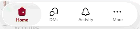
Enter iOS 26 beta 1 and its new UI, including its new camera app design. Instead of picking camera mode by sliding it into the middle like before, you move along a sliding tab bar with a highlighting piece of glass UI. It reversed the behaviour from before and took some getting used to. But with beta 2, they reversed course. Now you manipulate the tab bar behind the glass piece. While it mimics the original camera app more closely, it creates an issue because the glass highlighter isn't abstract, it's very much something on top of the different modes. So now you're moving something that is positioned below something while interacting above it, on a UI element that is not interactive, which is definitely not intuitive. And it get's worse by the fact that if you look at the tab bar in Safari, or any app with the new glass tab bar, it does the opposite. So you have two tab bars with glass highlighting your selection that operates in two different ways. That's a mess.
For camera modes, drag tab bar to change.For Safari tabs, drag the glass selector to change.
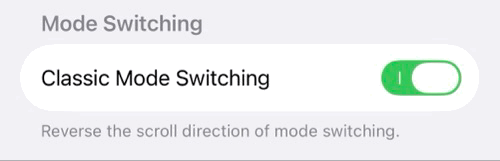
With a recent beta, they also included an option to toggle how you want the behaviour in the camera app, but unfortunately it defaults to the non-consistent one. And adding settings for such obscure things? That is distinctively non-Apple. Decide what's best and stick to it. I hope this part sees some improvement in the coming betas or later.
This is just one small thing in a new design language that is objectively problematic in so many ways. Subjectively, I just think it looks really bad.