Känner ni det? Känslan när gränssnittet väljer att hålla sig i bakgrunden så att ditt innehåll kan få skina?
Samtidigt: ”This creates a lively experience that makes using iPhone, iPad, Mac, Apple Watch, and Apple TV even more delightful”.
Delightful är inte ordet jag hade valt. Man slår knut på sig själv i att försöka rättfärdiga ett designspråk som inte borde fått lämna konceptstadiet. En himla massa fancy marketing speak för att rättfärdiga något man nog helt enkelt tyckte såg coolt och trots det höga priset av försämrad användbarhet, mot bättre vetande, ändå valde att gå vidare med.
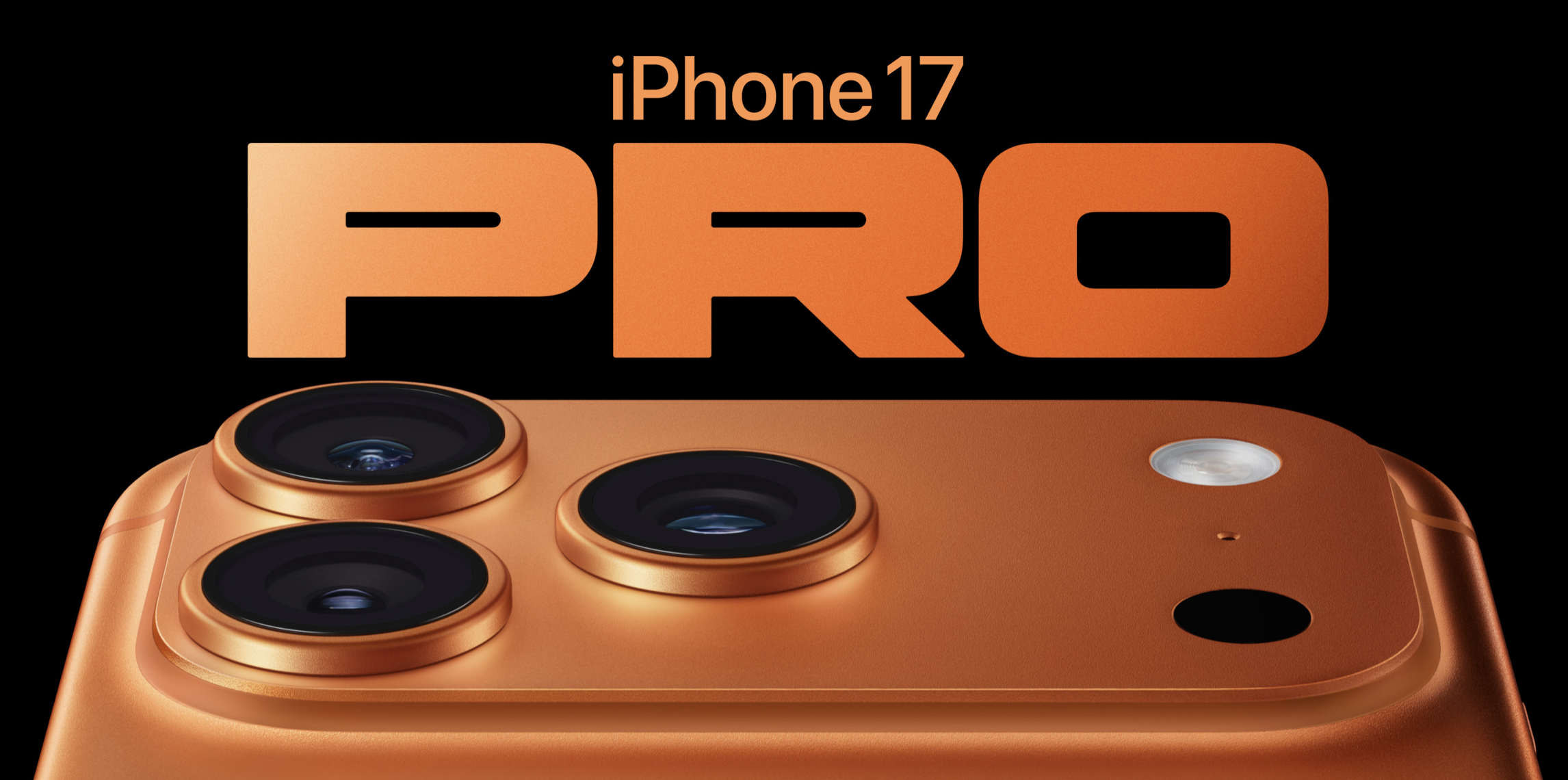
Inte en dag för sent att iPhone Pro-modellerna äntligen får någon roligare färg än bara mörkt, ljust och närmast homeopatiskt framavlade nyanser.
Orange råkar vara en favoritfärg, så visst kan jag vara partisk, men jag vågar ändå påstå att detta är den snyggaste iPhone Apple gjort. Den märkliga baksidan med den lilla keramiska rutan stör mig inte heller, snarare tvärtom. Den bidrar till en utility-känsla, vilket känns rätt för en produkt som ska heta “Pro”.
Egentligen hade jag tänkt hålla mig till att kommentera färgen på Pro, men eftersom iPhone Air faktiskt är en helt ny produkt i en helt ny kategori är det svårt att låta bli. Det är ett snyggt objekt med hög vill-ha-faktor, men ser samtidigt ganska svår ut att hålla i och skyltar tydligt med sina kompromisser. Framför allt på två områden som nästan alla skulle sätta på topp fem över viktigaste funktioner i en telefon: batteritid och kamera. Här har Apple (än en gång) på sin jakt efter tunnhet landat i en produkt som både har sämre batteritid och en mer begränsad kamerauppsättning än på länge. Vem är det egentligen som är beredd att offra det?
Sånt här tyckte jag var genuint roligt att grubbla över förr, men just nu känns det mest avslaget. Entusiasmen för Apple är på en all time low. De har inte förvaltat sitt arv särskilt väl och de har inte hanterat övergången från underdog till ett av världens största företag särskilt taktiskt. De har gjort sig ovän med i princip en hel värld av utvecklare och kompromissar sedan länge hejvilt med sina egna produkt- och designprinciper.
Men framför allt, eftersmaken av Tim Cooks upprepaderövslickeri av Trump är så genomträngande att den nästan letar sig över till min egen gom.
Anil Dash skrev förresten ett mycket bra inlägg om detta.
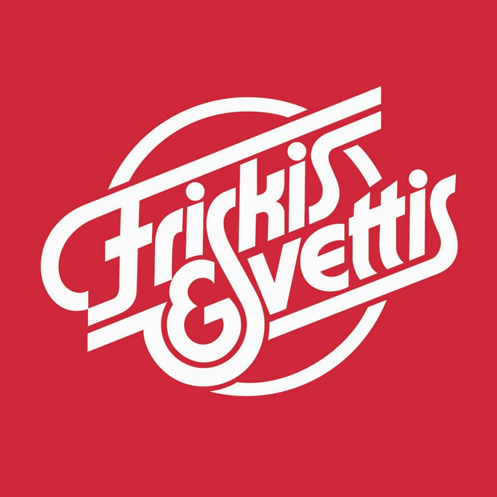
Friskis & Svettis is an institution in Sweden. A non-profit movement started in the late seventies with the goal to get Swedes to become healthier by way of exercise. All Swedes are familiar with Friskis & Svettis, it’s a very strong brand, in fact one of the strongest in Sweden. And they have this beautiful timeless logotype that has been around since the very beginning, inspired by blood vessels and pumping blood. Designed by illustrator and typographer Lars Laurentii, and his personal favorite or all logotypes he designed. It’s a beautiful logotype with immediate and positive brand recognition nationally.
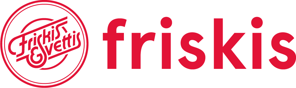
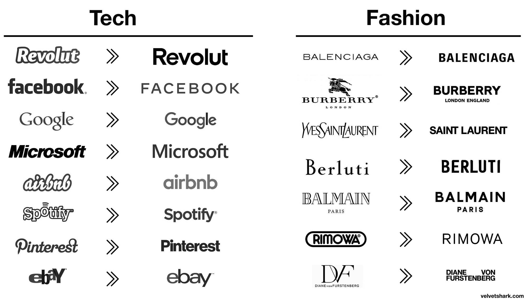
That’s why it pains me to see them make more and more use of a poorly spaced plain sans serif font like pictured above. I see it on busses, trams, billboards and online. It shows an organisation caving to recent design trends. Specifically the typographical logo trend to replace whatever you have with a minimalist sans serif font (the sans serif invasion) that says nothing about you as a company except that you’re now following instead of leading. The glimmer of hope here is that this generic font (Aperçu) didn't outright replace the old logo, for now only appending it or as a variant. The old logo is not out, but something is definitely in. And it has me worried and I hope they back away from this.
They already messed with the original logo once, making a less than stellar job updating it by making the lines thinner and adding rings. The changes disturb the harmony of the original, reducing the legibility and making it a little more sterile. And to no discernible benefit other than change for changes sake. Which is also a red flag of misguided attempts to address some type of challenge you as a company think you have.
Not all companies have great logos. Most don’t. And for misguided design departments or desperate marketing teams, I see the allure to follow suit when big successful brands change their logos. But when you’re sitting on one of the highest regarded brands with a price winning logotype everyone recognizes in positive terms, brand affinity through the roof, you should probably think twice before touching it. If your business is in need of change related to trends or globalization or competitors or other business challenges, look elsewhere for change than your logo. Your logo is rarely the reason for your current challenges. And messing with a good one can cost your brand a lot, see also Tropicana.