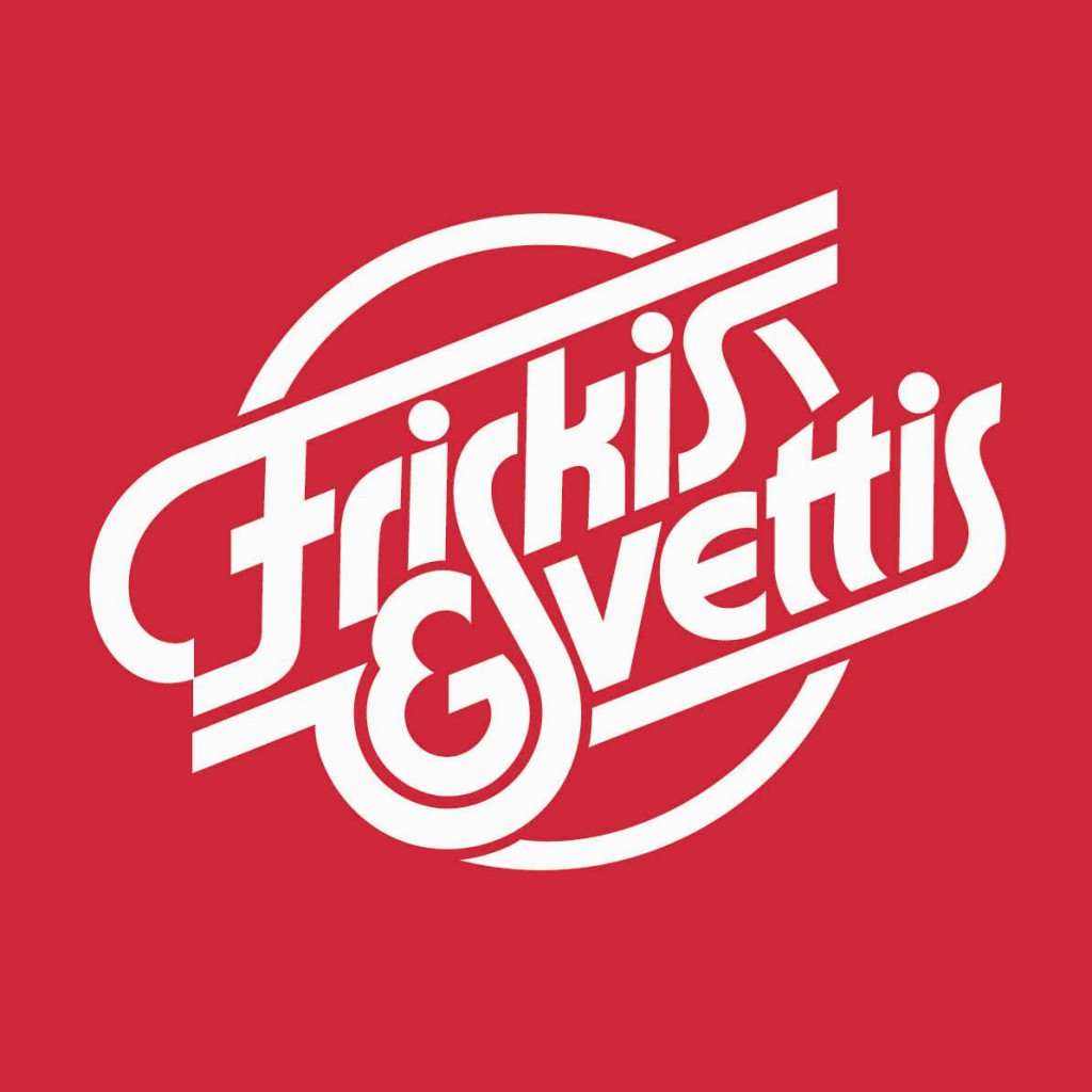
Friskis & Svettis is an institution in Sweden. A non-profit movement started in the late seventies with the goal to get Swedes to become healthier by way of exercise. All Swedes are familiar with Friskis & Svettis, it’s a very strong brand, in fact one of the strongest in Sweden. And they have this beautiful timeless logotype that has been around since the very beginning, inspired by blood vessels and pumping blood. Designed by illustrator and typographer Lars Laurentii, and his personal favorite or all logotypes he designed. It’s a beautiful logotype with immediate and positive brand recognition nationally.

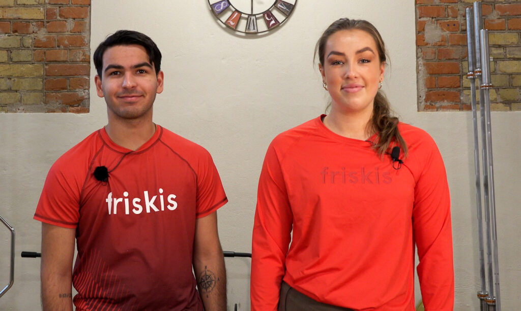
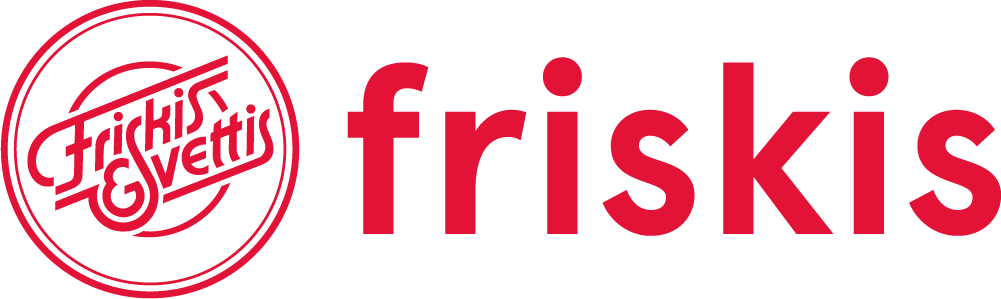
That’s why it pains me to see them make more and more use of a poorly spaced plain sans serif font like pictured above. I see it on busses, trams, billboards and online. It shows an organisation caving to recent design trends. Specifically the typographical logo trend to replace whatever you have with a minimalist sans serif font (the sans serif invasion) that says nothing about you as a company except that you’re now following instead of leading. The glimmer of hope here is that this generic font (Aperçu) didn’t outright replace the old logo, for now only appending it or as a variant. The old logo is not out, but something is definitely in. And it has me worried and I hope they back away from this.
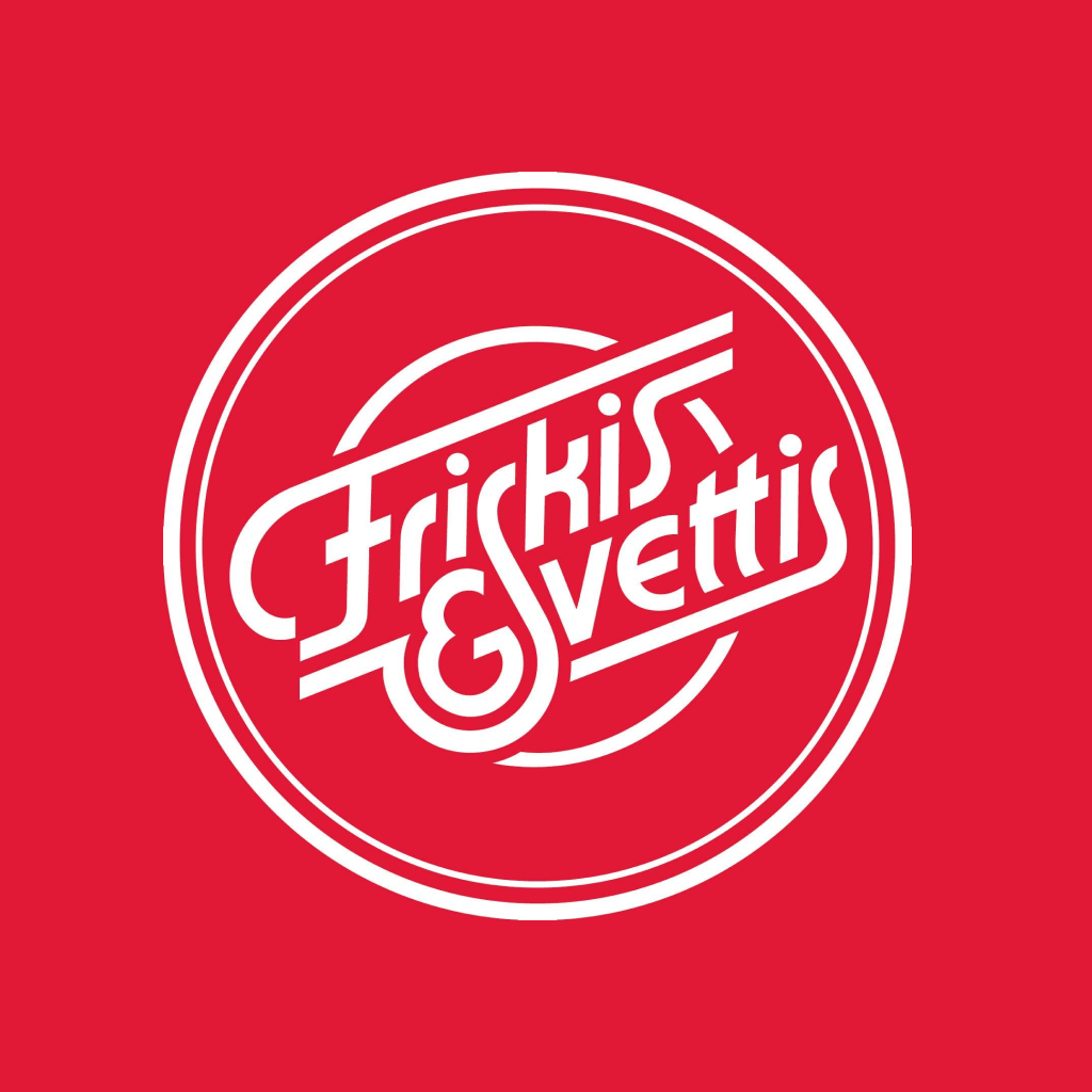
They already messed with the original logo once, making a less than stellar job updating it by making the lines thinner and adding rings. The changes disturb the harmony of the original, reducing the legibility and making it a little more sterile. And to no discernible benefit other than change for changes sake. Which is also a red flag of misguided attempts to address some type of challenge you as a company think you have.
Not all companies have great logos. Most don’t. And for misguided design departments or desperate marketing teams, I see the allure to follow suit when big successful brands change their logos. But when you’re sitting on one of the highest regarded brands with a price winning logotype everyone recognizes in positive terms, brand affinity through the roof, you should probably think twice before touching it. If your business is in need of change related to trends or globalization or competitors or other business challenges, look elsewhere for change than your logo. Your logo is rarely the reason for your current challenges. And messing with a good one can cost your brand a lot, see also Tropicana.
Leave a Reply
You must be logged in to post a comment.